Problem
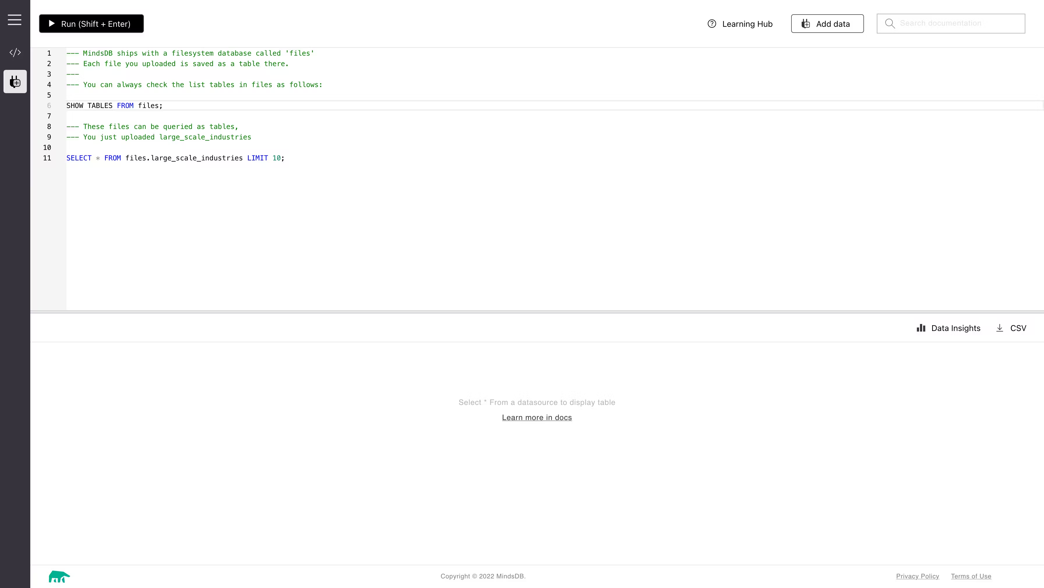
The old Mindsdb design system was built on a single Figma page. Lacking proper guides and organization, the old design system reflected the challenges of its early days when a single designer juggled both management and design responsibilities. Despite the simplicity and minimal number of system components, it was very hard to find or track changes in one file.
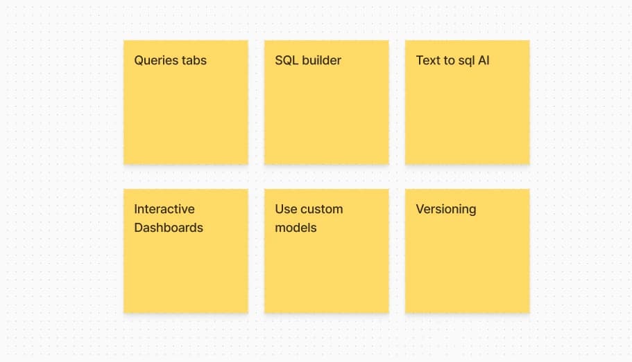
It turned out that the design system was not scalable and incomplete when we introduced new features such as chatbots, integration with LLMs, payment plans, and more settings. Often, we had to break design rules, add new components, and create new variants.
EVERY SINGLE TIME, We encountered a problem when the frontend implementation didn’t match the final design we delivered. This disparity required opening many issues after implementation to align the code with the final design. Despite providing detailed descriptions of each component, the lack of a solid design system with base components caused these gaps.
Challenge
The primary challenge we faced was the constrained timeline for implementing the new design system base. Therefore, we had to make a strategic decision to balance speed and quality. Should we build the design system from scratch or adopt an existing one? Are we mature enough to build a good system from the ground up? What naming conventions will we use? Do we have enough time to experiment and determine the best naming conventions that are clear and consistent to facilitate team communication, enable faster building, and streamline the handoff process?Process
After thorough research from both sides, we discussed with the developers in a call to determine our direction. Fortunately, the research results were aligned, and we agreed with the developers to use Chadcn because it is not a component library. Instead, it is a collection of reusable elements. Although it doesn't include all the components found in other libraries, it excels in customization. Additionally, it uses TailwindCSS, which is one of the most popular and best utility-first CSS frameworks. Our developers are familiar with it, and I am too. Therefore, we decided to use it and adopt its naming conventions.
Then, I conducted a heuristic evaluation and identified issues in the MindsDB GUI by testing it, considering user needs, and analyzing heatmaps. I pinpointed most of the UX, UI, and implementation problems that need fixes.


Since our target users are backend developers who want to create AI and ML-enhanced web applications, as well as business owners and business analysts who aim to augment their databases with AI, our interface needed to be primarily similar to databases tool applications but more intuitive. This ensures that it feels familiar to everyone.

Design system
I began auditing the existing components and how our developers implement them to decide which level of communication we need to bridge the gap between design and code.Then, start with the foundations of the design system, ensuring it’s accessible and compliant with WCAG standards.

To avoid any issues during the handoff to developers, I wrote the code and asked them to integrate it, ensuring it matched our requirements and design.


Using the Tailwind CSS naming convention, we didn't go far with design tokens at this time and only used global level and sometimes alias level.

For icons, we had multiple options: building our own icon set or adopting an existing one that harmonized with our typography and style. Actually, we did both because we are an AI startup and AI icons are not popular yet. It was hard to find what we needed, and there were many icons representing the same thing. For example, for "Model" some people use a spark, others use a bot head, a magic stick, or a box. There was no good icon library that had AI icons. So, we used an existing icon library and started creating our own icons for missing AI terms.
One of the small details I focused on was the quality of the icons used for integrations. Typically, we used whatever icons we could find, but unfortunately, most database providers’ icons were in PNG or JPEG formats, which weren’t suitable in all situations and would sometimes appear pixelated. So, I began collecting the icons and logos again in SVG format, and for those that weren’t available, I started designing them from scratch. In the end, this significantly contributed to the overall aesthetic of the interface.

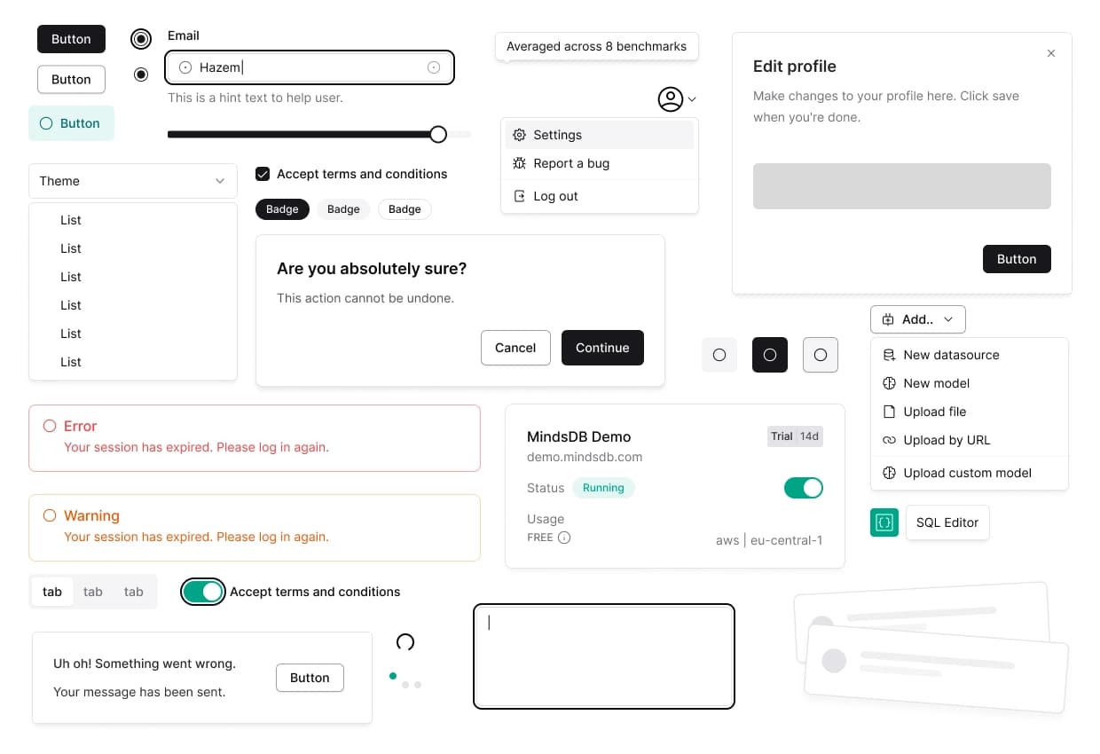
Then build the main components like buttons, dropdown menus, badges, input fields, and all required states found in our app.

Integrate the new design system into the GUI, fix UX/UI issues, and improve the overall user journey. Each part of the GUI has its own improvement story.

Redesigning the Mindsdb design system was a challenging yet rewarding process. By prioritizing scalability, accessibility, and user-centered design, we created a robust, customizable, and consistent system that supports the evolving needs of our product. This new design system not only improves the efficiency of our design and development processes but also enhances the overall user experience, making Mindsdb more intuitive and user-friendly. The focus on collaboration and addressing both technical and human aspects ensures that the system can evolve alongside the product’s expanding feature set.